It’s hard to resist a trip to Dairy Queen. Whether you’re tempted to pick up a box of Dilly Bars, hoping to see a Blizzard turned upside down or ready to order a ’60s Jack & Jill Sundae, there’s a treat for everyone. Yum! Not to mention, DQ’s classic chicken strip baskets, burgers and even chili cheese dogs. Don’t forget the fries and onion rings!
With so many great favorites, the Dairy Queen logo is as recognizable as the Starbucks logo. And it can be spotted in just about any town. But is it just a logo? Like the 7-Eleven logo and the Baskin Robbins logo, there’s actually a meaning behind it.
History of Dairy Queen
The first Dairy Queen opened in Joliet, Illinois in 1940 with a small soft serve menu. Items like shakes, banana splits and Dilly Bars followed soon after. By 1957, DQ started offering hot food in addition to cold treats. In the ’50s, the logo was very simple. It used bold text on a blue background, spelling out ‘Dairy Queen.’ On some signage and packaging, a large soft-serve cone would be added at the end.
Logos Through the Years
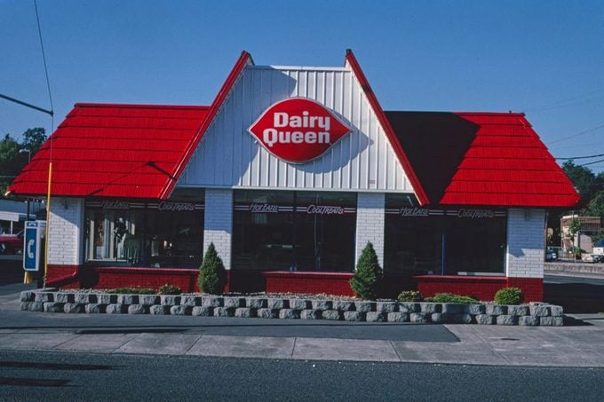 HUM IMAGES/GETTY IMAGES
DQ’s logo may have started out plain and simple at first, but it didn’t last long. By 1960, the logo with a blue background was completely transformed into a closer version of what we see today. The bright red shape resembled a pair of lips, with a white font spelling out ‘Dairy Queen’ in the center. That logo held on strong for more than 40 years before the text was simplified in 2001.
The 2001 logo swap followed after many customers began shortening the restaurant’s name to DQ. It dropped the spelling of the full name and simply featured ‘DQ’ in large bold white letters.
In 2007, DQ enhanced the Dairy Queen logo with a few simple tweaks. The letters were italicized and arched lines were added in orange and blue.
What Does the Current Dairy Queen Logo Mean?
The red shape still symbolizes lips as it has since the logo that debuted in 1960. But it’s the colored lines that hold a secret meaning. The orange arched line represents hot foods, while the blue arched line represents cold foods, like DQ’s popular soft serve treats. It’s a modern version of the chain’s 1960s logo, and ultimately, it’s become one of the most recognizable symbols in any small town.